Common Presentation Slides and Graphics
May 11, 2026
Reading time: 10 minutes
This is blog 15 of a 17-part blog series focused on helping you successfully win government oral presentations. To read the previous blogs, click here to find the index with individual blogs. In this blog, I’ll explain the fundamentals of slide design and some of the most common types of slides used in proposal presentations.
Concepts For Slide Design
The first thing you notice at most TED Talk presentations is the large amount of white space on each slide. Professional ad designers, like those for TED presentations, avoid filling the page with text. Before I launch into how the government contracting industry does it, I’m going to make an argument for designing some slides in your deck with mostly photos or graphics and using few or no words.
In 2017, Google CEO Sundar Pichai’s I/O 2017 Keynote presentation used a slide that only contained seven logos for Google's primary products (Search, YouTube, Android, etc.) and the following text: "1 Billion + Users." The slide explained that Google's products, individually, attract more than 1 billion monthly visitors. 
Source: https://www.youtube.com/watch?v=vWLcyFtni6U
Brain’s Don’t *Really* Multitask
Cognitive scientists have proven that the human brain cannot do two things at once and do them equally well (read more here and here). Specifically, we do not retain all the information when reading and listening simultaneously. To be clear, it cannot be done, and you lose the chance to really focus on either one. “Brain-friendly” presentations like Pichai’s let us focus on the speaker’s content without having to process the slides.
Nancy Duarte designs slides for a living and recommends following a three-second rule. Her primary takeaway is that if viewers don't understand the slide within three seconds, it's too complicated.
"Think of your slides as billboards," says Duarte. "When people drive, they only briefly take their eyes off their main focus, which is the road, to process a billboard of information. Similarly, your audience should focus intently on what you're saying, looking only briefly at your slides when you display them."
Superior Visual Memory
Molecular Biologist and Research Consultant John Medina researches how the brain processes information. His advice is to develop slides with dramatically fewer words and more relevant pictures. According to his book, Brain Rules, "We are incredible at remembering pictures. Hear a piece of information, and three days later you'll remember 10 percent of it. Add a picture, and you'll remember 65 percent."
The impact of the visual superiority effect is far-reaching. It can be applied to help you remember everything from a grocery list to every speaker point in a 100-slide deck.
Why Government Contractors *Nearly Always* Use Information-Dense Slides
Before I dive into some useful slide formats for your next proposal presentation, let’s discuss why most of your slides will not exploit concepts like the visual superiority effect and single-topic slides. The main reasons are industry culture and practice, page constraints, and standalone technical volumes.
Industry Culture and Practice
In the 2010s, Trident began using online collaboration tools. Trident’s team of proposal and capture managers would encourage proposal teams to adopt an online approach by making proposal documents available only online. Our clients’ cultures eventually followed suit. In many cases, this was only after we sold them on the value and taught them how to use the new tools. Now, in 2026, everyone uses these capabilities, and no one edits offline.
The point is that it takes time, and sometimes decades, for a culture to adopt a new approach to anything. This applies to developing proposal sides as well. As an industry, Government Contracting industry is decades behind commercial best practices for presentations. Proposal presentations still mostly contain text-dense slides and complex information graphics. I'll explain in the next section why the government needs to change the proposal presentation requirements for this culture to change.
Page Constraints
All proposal presentations have time constraints, and nearly every solicitation limits the number of slides. While the time limit naturally reduces the slide count to a practical number, adding the slide-count limit makes single-point and low-density slides and charts impractical. When faced with the choice between easier-to-brief slides and slides that give a complete, thorough answer, the latter wins every time.
Stand Alone Volume
The government may review the printed proposal presentation separately from the oral presentation, and it will often explicitly state that the proposal presentation will be graded as a stand-alone volume. With this in mind, and with the page count restriction reducing the total slide “real estate” available, our clients will use information-dense slides as standard practice to get as much information into the deck as possible.
I agree with this approach from a data-driven perspective. The proposals that win feature mostly high-density information and graphics, graded separately after the oral presentation is complete.
Sometimes the government will video the presentation. Over the years, I have interviewed retired contracting officer and learned that they keep the recording in case of a protest and rarely use the video for evaluation purposes. Instead, they will rely on their notes, what they remember, and the offline presentation to finish grading the proposal.
Now that you understand the visual memory of slides and why slides are often formatted the way they are, we’ll move to the common parts of a slide.
Common Parts of a Slide
People move from company to company and take ideas with them. Very often, the prime contractor will have small businesses working with them on the static presentation and providing subject matter experts as part of the presentation team. Through this process of sharing, I’ve noticed over the last 15+ years that certain slide concepts are included 95% of the time. This culture of government contracting incentivizes collaboration and movement of ideas, which has created an expectation of common, fundamental ways of presenting slides. This is a long-winded way of saying that these parts are the standard. This generic slide will illustrate these parts. 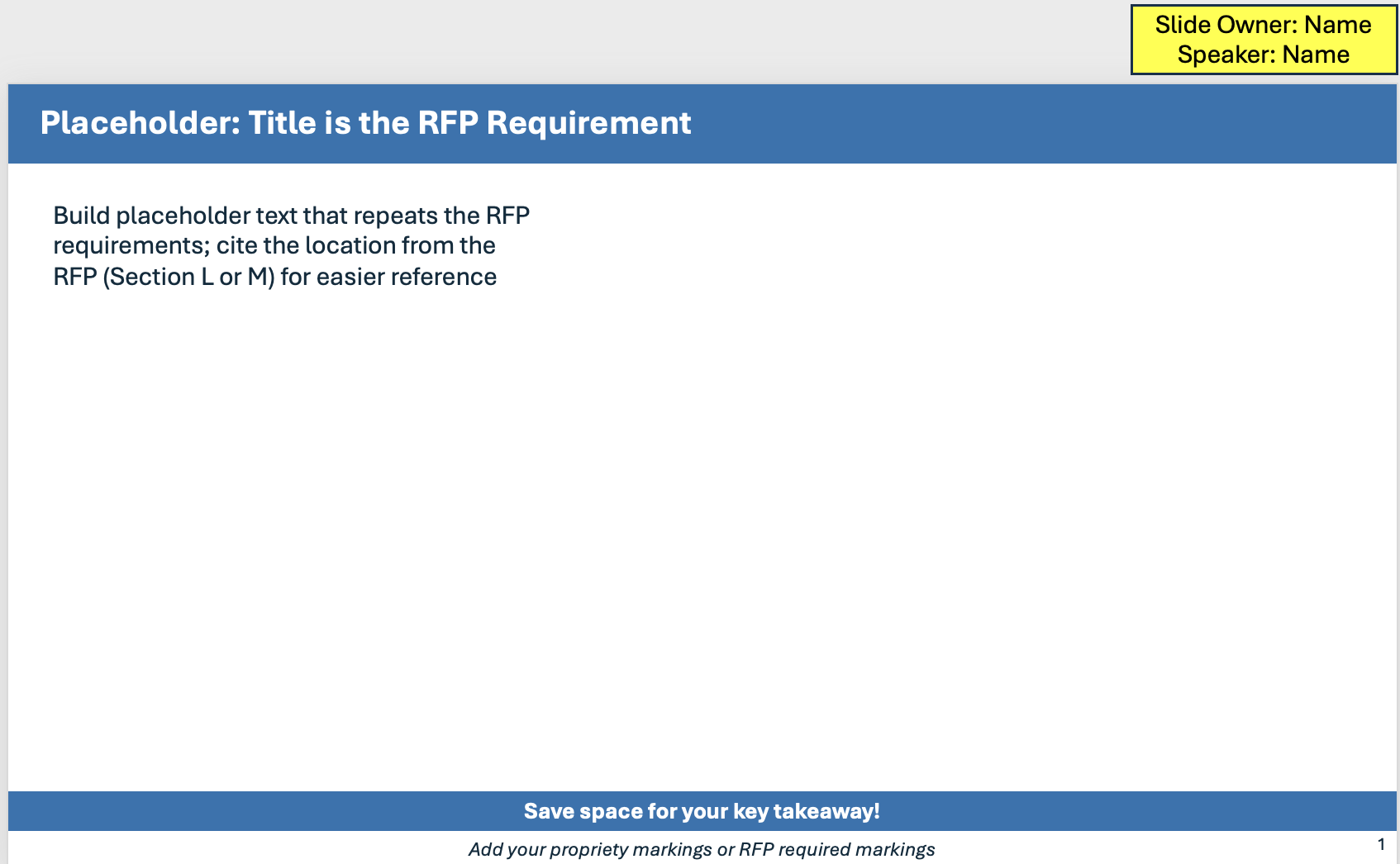
✓ Headline: As a standard part of any generic presentation, the headline provides the slide's subject. In proposal presentations, when a headline has the specific words in the solicitation, the technical evaluation board has an easier time grading your presentation.
✓ Bumper Sticker: The bottom of many slides contains a text box with a statement summarizing the most important takeaway.
✓ Breadcrumbs: In a nod to a children’s fairy tale, breadcrumbs annotate the slide so that the TEB can quickly match the major questions or areas of the presentation addressed by that slide.
✓ Solicitation/RFP Annotations: These annotations map the statement of work, Sections L and M, and other parts of the solicitation to the presentation, making it easy for the TEB to grade your presentation both standalone and while you present.
✓ Example Box: This common slide construct keeps the past performance and relevant example data in the same spot on every slide. This makes it easier for the TEB member to find this information to substantiate an outstanding grade.
✓ Footer: The slide footer, at a minimum, should contain the page number of the slide, which is often a requirement in the solicitation. Often, the footer contains more informations, including proprietary or classification markings and references.
Now that we have mapped out the standard parts of a slide, let's look at common ways to display information that meet government requirements. I have laid out for you the most common slides below.
Process, Approach, and Method
One common request in a solicitation is the offeror’s process, approach, methodology, or a similar step-by-step approach to accomplishing the requirements. You might be wondering what the differences are between a process, an approach, and a methodology.
A Rose by Any Other Name?
Typically, the government will specify what it wants for the process, approach, and methodology in the solitication requirements. When that is the case, always use their definition. Often, the three are used interchangeably with no distinction. In this case, I coach my clients to use approach that provides the highest-level overview of how they do their work. An approach is an overview; it includes many sub-processes, concepts, steps, and situations. A process uses specific steps, which may include important sub-steps that need to be displayed or briefed for full credit. I consider a methodology to be the most basic and repeatable process, in which each step stands alone and has no sub-steps.
Here are the five most common types of graphics or lists we see in proposals. (Note: The graphics created are examples and can be used as a starting point. If you’d like help with your proposal graphics, contact Trident to learn how our graphic artists can help bring your text to life.)
1. Numbered List
A numbered list presents a process in a simple, easy-to-follow way. Numbered list are used as whole slides or within a slide section to indicate a sub-process (see figure below). Because a numbered list doesn't include any extra graphics or details that make it hard to understand, it doesn't require any extra thought for the TEB to assimilate and grade. The presenter will also have no problem going down the numbered list in order and presenting the process with examples woven into the talk.
- Step
- Step
- Step
- Step
Numbered lists have only a couple of downsides.They tend to leave whitespace on the slide that might have been used for more detail in a stand-alone presentation. They also don’t use any visuals, so they miss out on the impact of visual memory in the TEB.
Commonly used in the Caucus and Response, the numbered list process slide is usually replaced in a static presentation by one of the following.
2. Simple Tables
A way to use more “real estate” with numbered lists is to present them in a table format, using the columns to provide more detail for each step. Here is a simple example.
|
Step |
Sub Steps |
Exceptions |
|
|
|
|
|
|
|
|
Tables are a fantastic way to document a process. Table are easy to fill out and don't require much. Once your team fills out the table, the graphics lead uses that information to create a graphic that represents the process.
3. Chevrons and Arrows (with or without feedback loop)
Chevrons, the standard Microsoft Office graphical arrows, and other process graphics are the darlings of proposal presentations. I’ve seen a version of the chevron chart in hundreds of presentations, probably because Microsoft and Google include it as a standard feature in their templates. The chevron chart keeps the main idea by placing the proces steps at the top and emphasizing them with font size, color, and shape. The arrow-like quality of the chevrons makes the process flow even more obvious and easy to follow. Finally, the way the chevrons as a whole stand out makes it easier for the TEB to ignore information-dense sub-bullets and focus on the speaker as she moves from phase to phase or step to step through the approach, process, or method.
Frequently, a chevron chart includes a feedback loop. The feedback loop typically indicates that the team will apply lessons learned from the prior process going forward.
4. Process
Only slightly different and more graphically interesting than a chevron chart, the circular chart makes the feedback loop more prominent or explicitly shows how the end of the process feeds back into or triggers the process restarting. Notice that the circular chart takes the entire center portion of the slide and tends to take up more space on the slide. This style of process chart can be used when you don’t need a lot of space for detailed bullets and when the following slides go deeper into each phase or step.
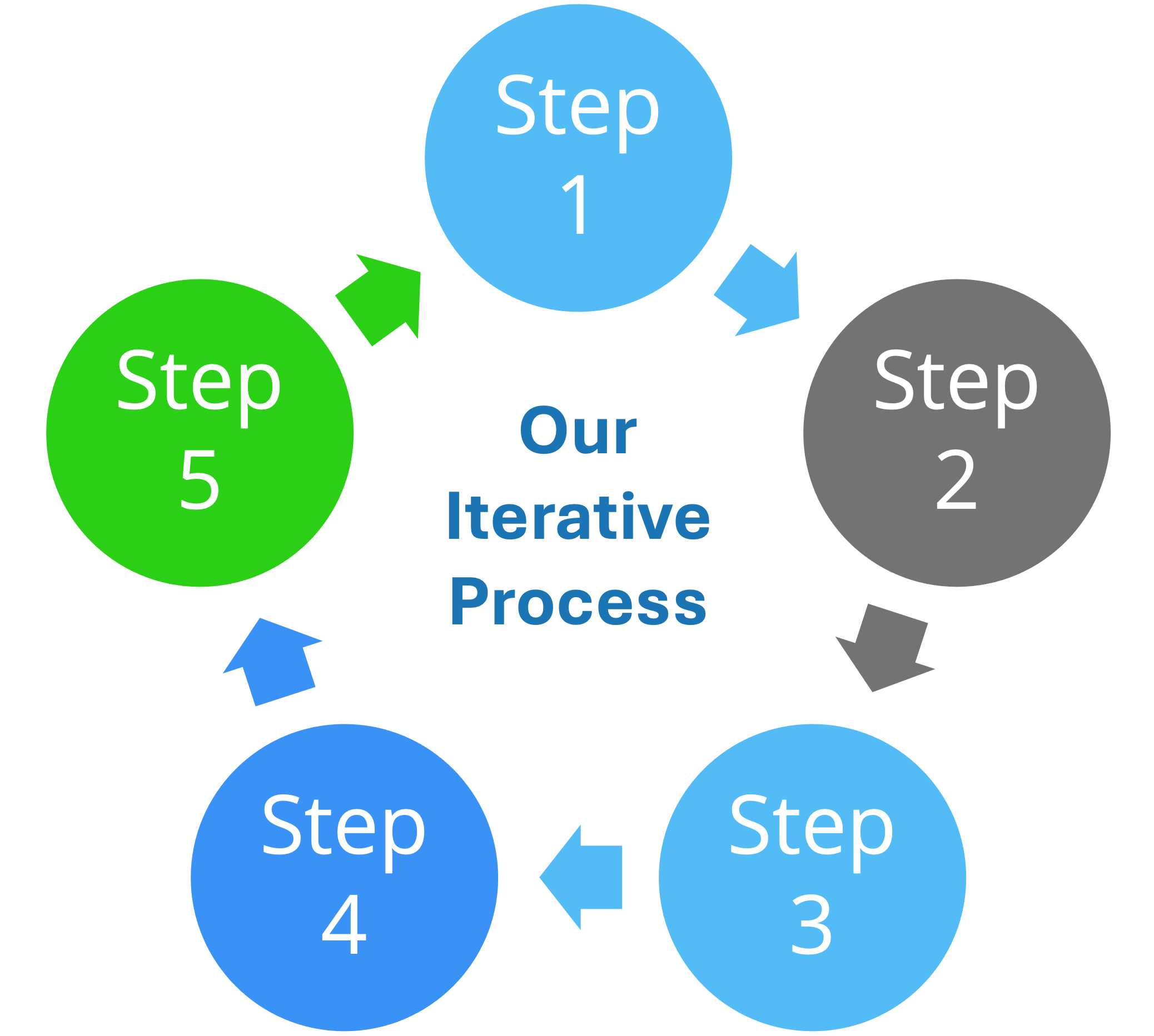
Chevrons and circular processes make great breadcrumbs in the slides.
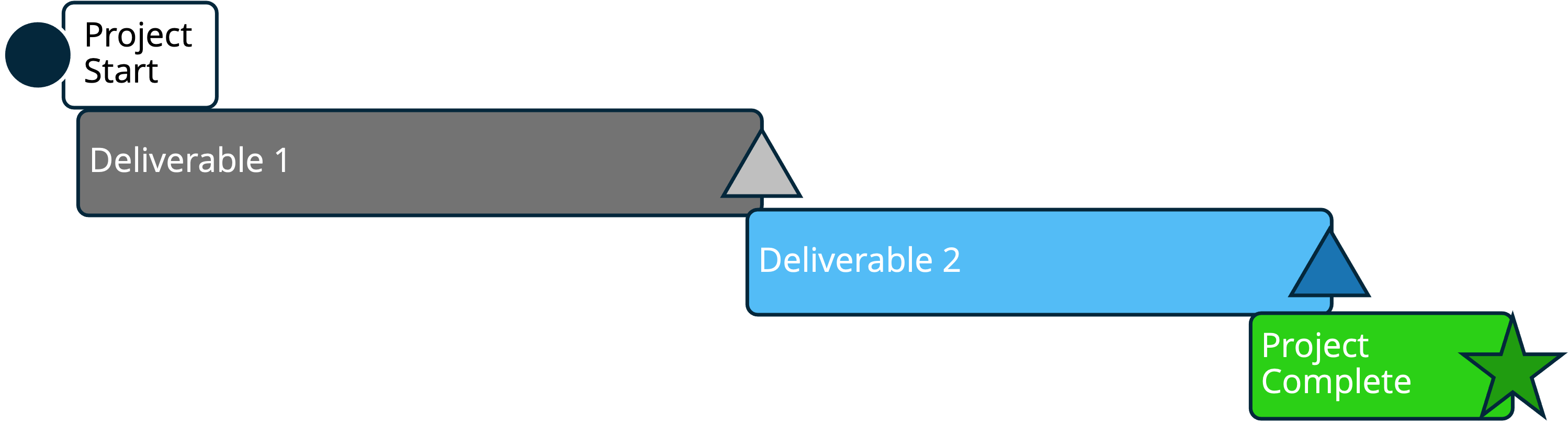
5. Waterfall process
In traditional government contracting, the waterfall chart shows an integrated schedule of events, tasks, milestones, and dependencies required for a successful project. In the same way, a proposal presentation waterfall chart will show a greater understanding of the larger process and how everything connects. In practice, waterfall charts have a lot of detail and are typically generated from extensive spreadsheet or project data. It is not practical to display this level of data in a presentation, and it is a major drawback and risk factor for proposal presentations. The team will have to balance having enough detail to make it a credible chart with making it readable in the presentation.
Why We Don’t Use Animation
We encounter teams who deeply desire to add motion to their presentation. While some solicitations specifically forbid the use of animation or graphics in presentations, others are not cut-and-dry. In other instances, the final response is submitted as a PDF, with no animations enabled. When a team mentions they want to use motion, I strongly discourage their usage for a number of reasons, including:
- Submission Requirements: In addition to possibly being forbidden by the solicitation, often, presentations are submitted as PDFs. This disables all motion. The team that uses motion will also need to ensure that none of the active text or graphics are removed or hidden in the static PDF.
- Fragmentation: Images in motion represent different parts and concepts of the presentation, appearing and disappearing in a few seconds. The TEB hardly has time to read one thing when whoosh, the image changes, and they have to refocus. Their attention is fragmented, and they are no longer listening.
- Changing focus: Our brains respond instantly to sudden movement and quickly shift their focus to it. For example, if your slides suddenly move, our brains cannot distinguish this from a real threat in the first millisecond, prompting us to shift attention. This response is known as a saccade. It is an involuntary motion of the retina in response to movement, and the speed of this eye movement during a saccade is uncontrollable.
- Technology: Despite it being 2026, some software may still lag behind. Your team may not know whether the government-provided requirement can handle motion or moving graphics.
Build Slides for Delivery and Evaluation
Strong proposal presentation slides strike the right balance between clarity of your proposed solution and completeness for the evaluators: use visual simplicity when it helps the team follow your message, but never at the expense of compliance, traceability, or the deck's standalone value. This approach works becuase winning slides are not just easy to brief, they're also easier for the TEB to find, understand, and grade you favorably (Read more about Developing the Deck).
If you want a competitive edge, consider Trident’s expert proposal graphic designers and deck developers to help create clear, compliant, and compelling presentation materials that set you apart. Contact us today.
Written by Jeff Everage
Jeff is the President and Founder of Trident Proposal Management. As a GovCon Oral Presentation Coach for more than 15 years, Jeff has coached more than 100 teams to success. His insights into oral coaching, gained from the trenches of coaching, are designed to support you and your team in your efforts. As a Navy veteran, Jeff resides in Southern California and provides support to clients worldwide as part of our globally dispersed team.